With a clear goal in mind – to browse for a white dresser – we reviewed some national e-commerce sites. But now we won't do an exhaustive analysis of the online browsing/shopping experience, as we are more interested in addressing the particular case of search results.
With that objective, here we want to show some good practices to make searching an e-commerce catalog a pleasant browsing experience that optimizes conversion:
1. Visible search engine indexing all products
The search engine should be on all pages, always in the same place, and should index all products.
Let's see how we fared in our quest to find a white dresser.
Comparing searches for the word "cómoda" (dresser with accent) with "comoda" (dresser without accent) on a first site, we observed a significant difference in the number of products found: 21 for "cómoda" versus 7 for "comoda".
2. Predictive search engine
No one will be penalized for not having one, but having one is clearly a plus for facilitating the search. The second site has a predictive search engine incorporated, and it seems to work on all pages... except the home page. We thought we would do better on the third site, as we frankly liked the predictive search engine, which also considered the accent. However, when clicking on the categories suggested by the search engine, we encountered a 500 error (a server error, for the less "technical").
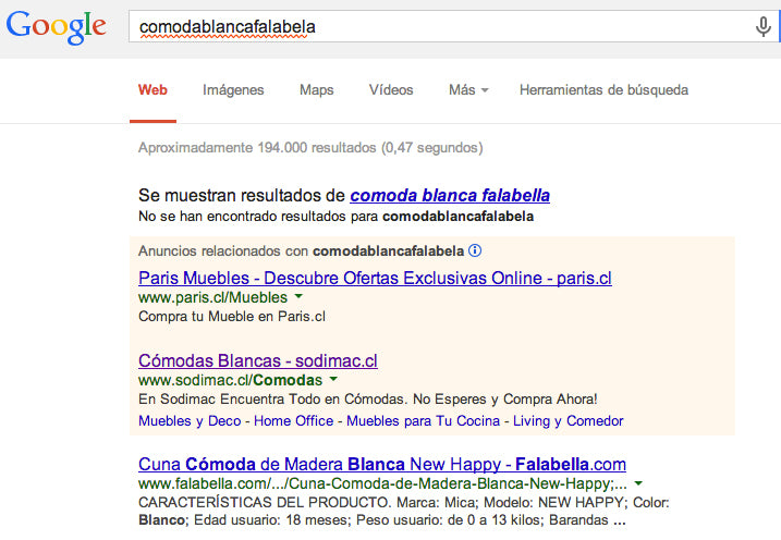
3. Proper handling of the \"0 results\" page
More bad news from our dresser search: on two of the five sites visited, the search engine yields no results when searching for words with accents. This is where the user might abandon the site and go browse the competitor's website, thinking that the current site has nothing to offer them.
What would a good \"0 results\" page look like?:
4. Good use of filters on the results page
Because the search doesn't end with the first results page, it's essential to be able to navigate easily using filters. For example, on the fourth site, after leaving the tab inactive for a few minutes, we couldn't continue the search because when clicking on the \"Dressers\" filter, the site led to the \"Fashion\" section.
On the fifth site, we observed two distinct colors: White and white (!), for a total of 4 dressers, when in reality a simple count allowed us to see 8 white dressers.
5. Anticipate user \"errors\"
Typing with or without an accent, with or without double l or r, not leaving a space between two words, are typical user errors that the search engine should anticipate.
6. Properly train the person who manages the catalog
It seems obvious but it's not necessarily so. The site may have a powerful catalog, with many functionalities and even be usable. However, if the person who manages it is not clear about their role and the importance of filling in all fields correctly – or not creating colors like \"White\" when \"white\" already exists, for example – any detail could impact the user experience and lead to a drop in conversion.
7. Think about the omnichannel experience and also ensure marketing – web coordination
It sounds complicated but it's not. Let's take the example of a Google search network ad (Google Ads) where a company offers up to a 60% discount on a dresser. What happens when you click on the first ad? We arrive at the furniture offers page, where there is no dresser at first glance and the filter also does not allow searching by category. Reviewing all the offers, we finally confirmed that there was no dresser on offer, not even on the second results page.
To illustrate, here are some furniture e-commerce sites that offer a superior search experience:
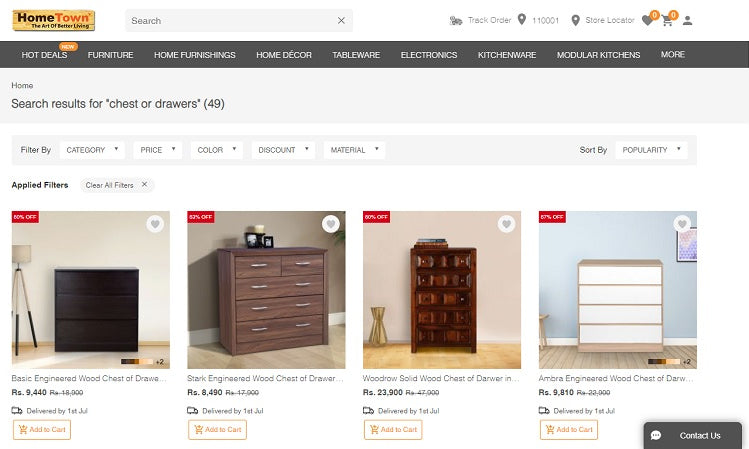
www.hometown.in
- Predictive search engine working properly.
- The filter area is fixed, allowing it to be permanently visible even when scrolling.
- The color filter incorporates color swatches, thus facilitating the identification of the desired color.
- The price filter takes up little space. Note that slider buttons require great care when implemented on mobile/tablet, as on small screens with low sensitivity, they can cause frustration. Includes a material filter.
- The searched word is quoted.
- As a bonus track, discounted prices are very well highlighted.
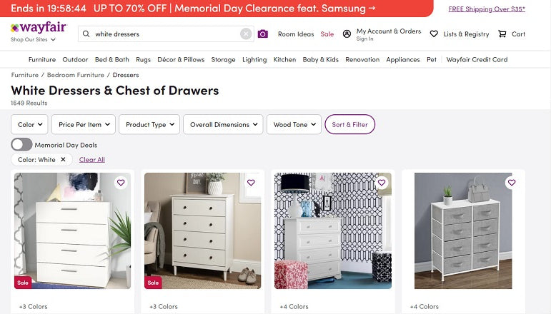
www.wayfair.com
- As in the previous case, the search engine correctly interprets keyword sets with the furniture type + attribute.
- The searched word is quoted.
- The color filter incorporates color swatches.
- We like the option to view only images, without details, optionally of course.

 By
By