At FREED, we have conducted over 200 expert audits of e-commerce sites, where web usability is one of the most important aspects among all the points we evaluate. Based on that experience, we are sharing with you, in various articles you can find on our blog, many tips for improvement and warnings about frequently made mistakes. Previously, we explained what Usability is and why it should matter to us, an article that will complement the content we will see here.
Now we want to delve into the usability errors we commonly detect on our clients' e-commerce sites, focusing on the most critical ones, so that you can review the status of your own site and make the necessary improvements to optimize your online business.
Article updated on December 26, 2025.
More and more people are enjoying the convenience of shopping via mobile phone and prefer fluid experiences when making a purchase. While responsive design, which allows browsing e-commerce sites using different devices, is already a standard for practically all platforms and in every web development project, it is still common to find errors such as the following:
- Texts exceed the screen width or overlap other content.
- Button texts go beyond the graphic element's margins or the element breaks.
- Photographs exceed the screen margins.
- The menu does not deploy or links do not work when tapped.
- Some functionalities operate with difficulty or simply do not execute.
- Lightbox or popup windows hinder navigation (most of the time the "X" to close them is not visible or is practically hidden).
These types of problems directly affect the potential customer's experience and immediately result in lost sales. If you consider that a good portion of internet user traffic comes from mobile devices and mCommerce (the widespread adoption of purchases via smartphone) is already a trend, this is the first point you should focus on in managing your online business in terms of web usability. Our recommendation is to constantly review how your site behaves on different mobile devices and operating systems. You should be aware of these types of details that respond to changes in people's behavior and thus ensure that you are adequately meeting that demand.
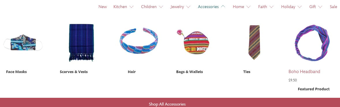
Example of confusing navigation due to a menu with product subcategories placed in an unintuitive way, making it difficult for the user to find them quickly.
Your premise should be: get the customer where they want to go easily and quickly. Think that a person who entered your e-commerce site got there because they probably did a Google search, so they already know what product or service they want to buy. Now the challenge is to achieve that goal without problems. At this point, you should pay attention to your menu, where categories and subcategories must illustrate the content that is actually in that section.
Also, avoid complex structures and ensure that the person reaches their goal. That is, design navigation with few levels so that it is easy to get there and provide aids such as breadcrumbs. And never forget this: before investing in innovative design, the priority is to offer consistent navigation.
Now we see the menu of the same e-commerce site, after redesigning the site. Navigation was optimized by showing better-defined subcategories and using images for quick identification.
This point connects with the previous one because design is a factor that can completely spoil the web usability of an online business. Here your objective should be:
- A pleasant design that looks good at first glance and helps keep the user on the website.
- Avoid excessive images, buttons, links, and other elements that distract the person from the focus, which is none other than making a purchase.
-
Offer a simple experience. This is achieved by leaving enough white space; yes, hard as it may be to believe, you must leave spaces without content so that the user can read texts and images more clearly and thus avoid confusion that leads to erroneous actions when interacting with the e-commerce site.
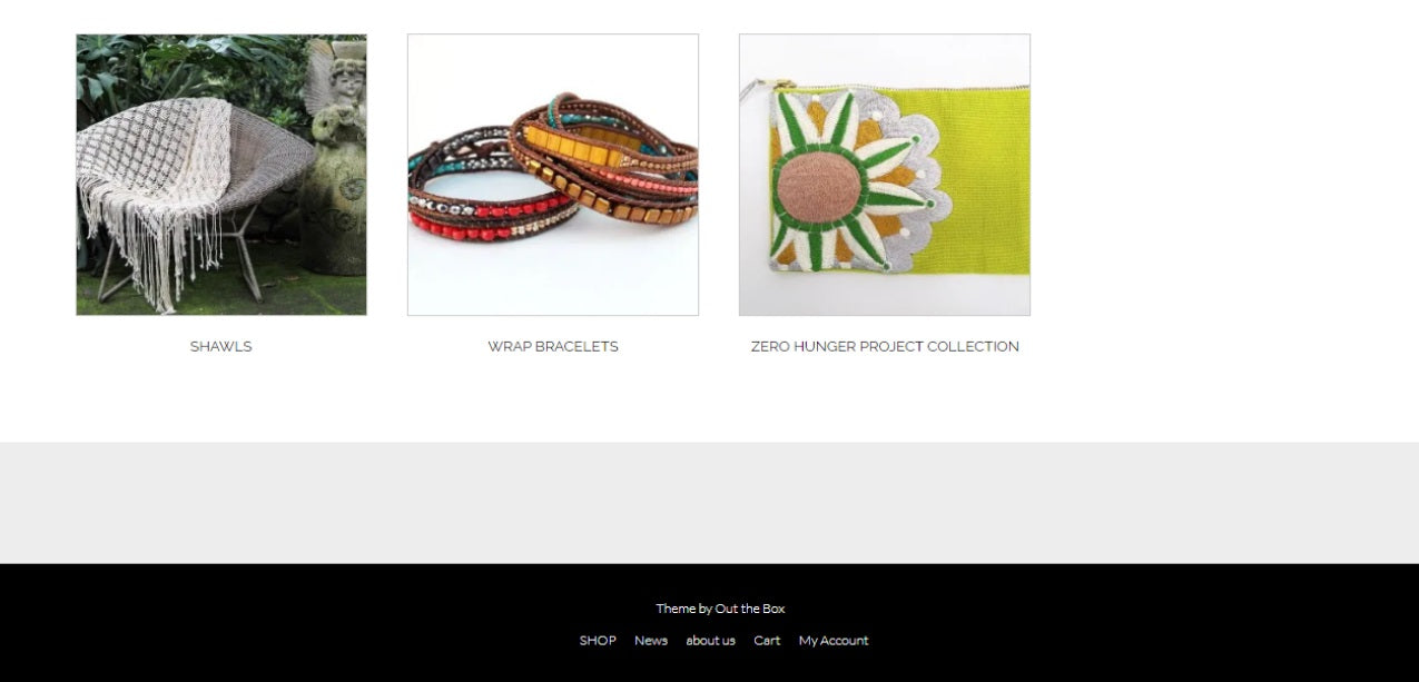
Example of an e-commerce website: the footer does not contain links to critical information such as Terms and Conditions, site policies, Help, About Us, and contact methods.
It is vital that in important flows, such as the purchase flow, you have contextual help that facilitates people's task resolution, such as the format in which data should be entered and error alerts to correct misspelled information.
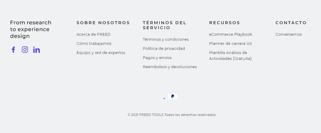
Likewise, your user must have all the support and information that is crucial for making decisions related to the purchase. This means publishing on your e-commerce site and in a visible place:
- Contact methods (form, phone numbers, email, etc.).
- Site policies (Terms and Conditions, Cookies, Privacy, Shipping, Returns and Exchanges).
- About Us and other company information.
- Frequently Asked Questions and Help section.
- Payment methods, etc.
The FREED.TOOLS footer with links to critical information for purchase decisions.
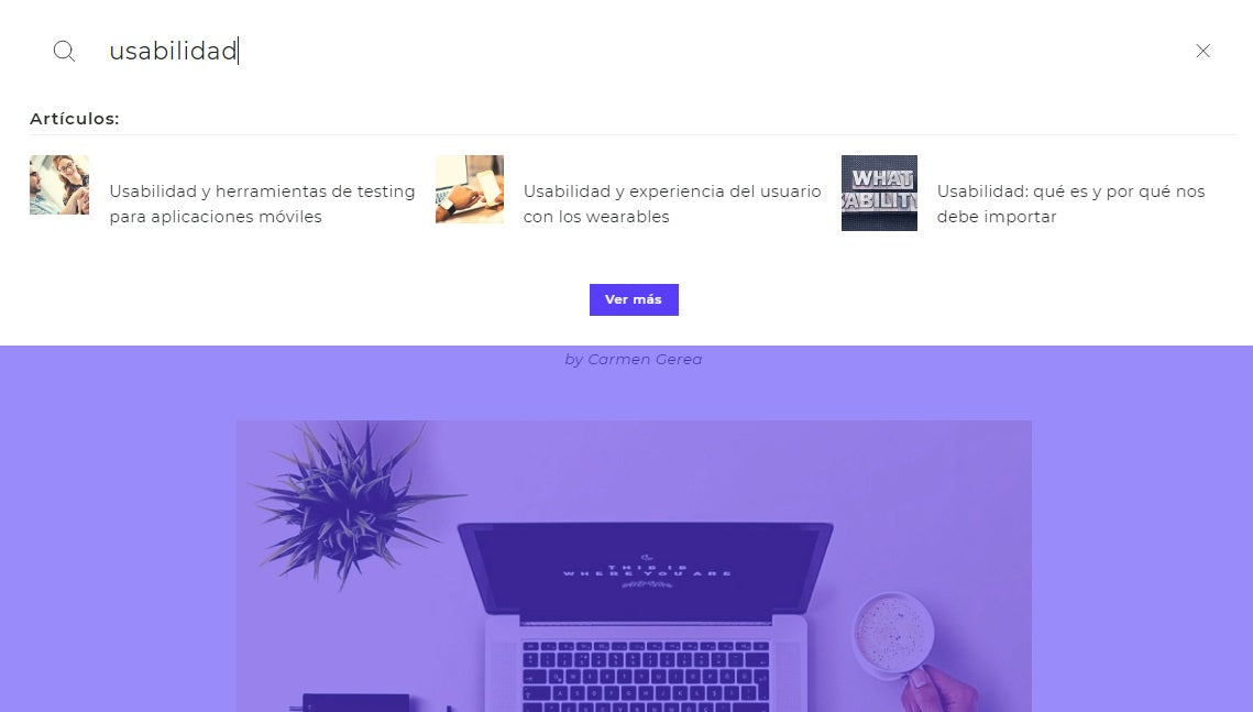
Google is the most popular search engine and practically has a monopoly on the internet, but don't leave everything to it. As we said before, the person who arrived at your site probably already knows what they want to buy, so they will want to move quickly, avoid using the menu, and the first thing they will do is go to the search engine. In other words, they will want to repeat the same successful experience they had with Google but within your e-commerce site. Therefore, you must enable a search engine that guarantees optimal web usability, complying with the following:
- That all content related to critical information for a purchase (which we saw in the previous point), and not just products, is indexed and easily findable.
- That results are delivered quickly and in an organized and clear way, in order to be able to reach what is being searched for in one click. That the search engine is present on all pages of the e-commerce site, located at the top or header.
The FREED.TOOLS search engine is present throughout the site and delivers clear and organized results for all site content.
Example of a web page where two errors that hinder reading are committed: an inadequate font size is used and a background that does not offer good contrast.
Part of a good user experience with your e-commerce site involves favoring on-screen reading, ensuring correct legibility. Think that people will come to look for information and the idea is that they feel comfortable, but reading website content can be tiring; in fact, users prefer to scan the page for important data. So, to make this experience more pleasant:
- Use fonts that are easy to read on screen; sometimes more sophisticated fonts make things worse because they become illegible.
- Use an appropriate color and sufficient size.
- Ensure good contrast between the screen's background color and the shade you use for the typography.
This page meets the usability parameters we discussed.
This last point could be said to be a summary of how to ensure consistency from navigation to content within your e-commerce site. The premise is: use a standard design across all pages. Often, creative flourishes hinder the user experience and end up on the list of web usability problems, when the reality is that no matter how much work you've done to make the website attractive, what users require is a consistent look and feel. Therefore, a good web designer must know how to define the limits to guarantee this consistency when navigating through each of its pages. To comply with this precept, you must:
- Avoid the coexistence of different designs within your e-commerce site.
- Avoid designing mini-sites outside your site that involve taking the user out of natural navigation.
- Always maintain a design that favors simple and informative pages.
Users always favor simplicity and intuitive functionality over sophisticated and innovative design. So your challenge should not be to have an online business with all the latest technology and design, but to avoid web usability errors, continuously improve by learning from those errors, and prioritize offering a fluid experience to your customers.
If you want to delve deeper into this topic, we invite you to review other articles of ours such as the arguments to convince your boss to invest in usability and user experience and usability and UX in lean times.
Do you know of other web usability problems on e-commerce sites? Share them with our community.

 By
By