Article updated on October 21, 2025.
Have you ever, as a user, cursed the person who designed the form-filling process on a website? Most likely, you got annoyed because you were forced to complete too much data to register or buy a product. The truth is, I've been through the same thing many times.
In this blog, we have already covered various aspects of UX and web usability, but we had not dedicated an article to review the particularities of forms.
And, as simple as they may seem as tools, forms are a tremendously important element in the lifespan of a web project and with a relevant impact on conversion, if it is an e-commerce store.
In this sense, there are design and user experience aspects that are worth reviewing and testing to evaluate whether it is necessary to completely change your forms.
Therefore, below we show you some elements to consider to help you improve conversions and lead capture on your website.
To do this, use design resources, colors, and a prominent location to make it easy for people to find your form.
In other words, make this contact space stand out from the rest of the site and accompany the user in the most relevant moments.
Here applies the concept of less is more, very recurrent when talking about design and user experience on the web.
It should be noted that a study conducted by Columbia University showed that offering too many options to people causes indecision and, ultimately, they will not choose any for fear of making a mistake [1].
In some cases, small changes to make our forms and checkout processes simpler can have a great impact on the conversion rate.
The text accompanying the form should be attractive and its mission will be to answer a tacit and fundamental user question: What is the reward for providing my data?
The important thing is that you indicate the advantage or benefit that the person gets if they register.
Another alternative is to use imperatives or questions in the titles.
In the first case, you are giving the user a call to action, and in the second, you will generate a reasonable doubt that invites them to read what is below that title.
As with content in general, when we talk about web usability, in a form, the texts and associated fields must be aligned in a way that facilitates reading.
Good alignment of fields and labels in a form is crucial for the perception of order, and will help reduce cognitive load.
More simply put, an organized form has a greater chance of inspiring confidence and getting the user to fill it out, versus a disorganized form where the user usually feels lost and tends to abandon the task.
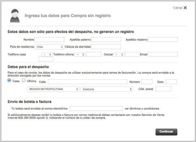
The following form, although it may not seem to have a large number of fields, does not leave a feeling of visual order; on the contrary, the user may feel dizzy:
Form source: falabella.com
These are the fields that collect the data that are essential to carry out the transaction with your form.
For example, the minimum for a subscription would be email and name. But for a purchase, you will need more information, such as the complete shipping address.
So, the required fields must be clearly identified so that the person knows in advance that they will not be able to complete the process if they do not fill them out correctly.
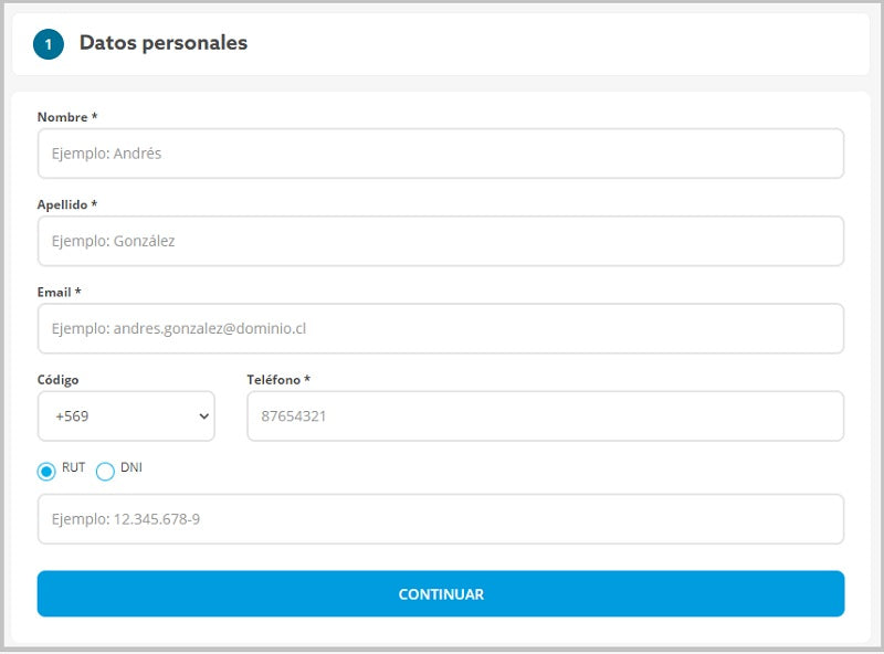
The most common way is to warn at the beginning of the form that the fields marked, for example with a red asterisk, are considered mandatory. And, obviously, each of these mandatory fields must carry this mark very clearly.
Form source: paris.cl
To do this, simply put yourself in the user/customer's shoes and ask yourself the question: Is it really essential to know that person's age or phone number?
Perhaps it is not totally necessary in most cases to complete the transaction. This is another design and user experience decision.
So, request this type of data as optional or non-mandatory, and allow anyone to fill out your form with only their email and name.
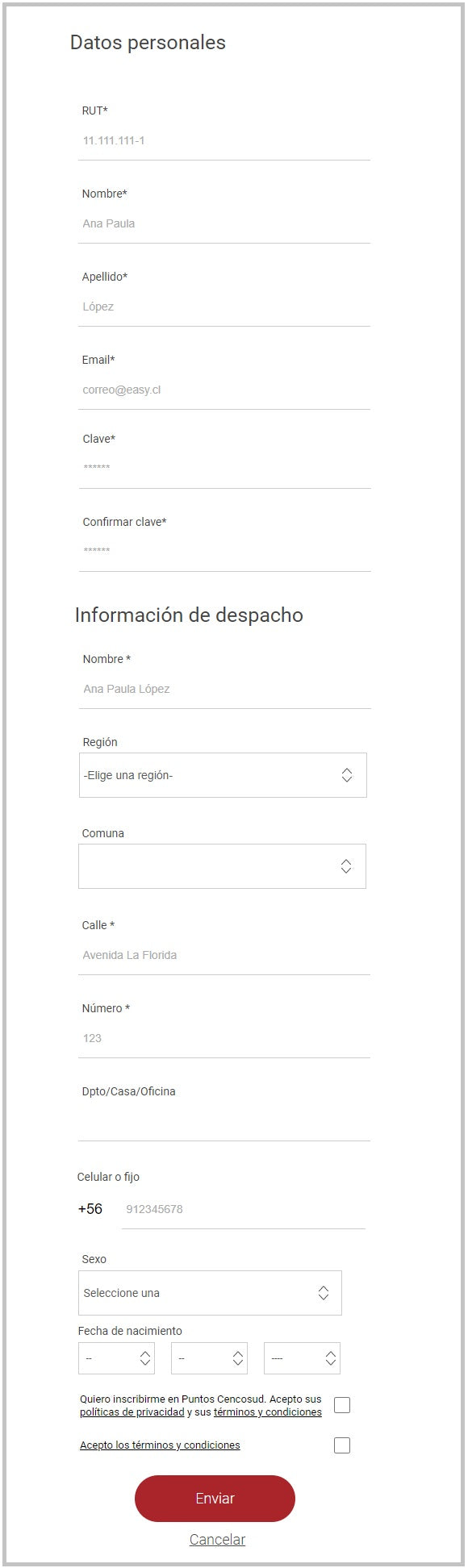
If it is really necessary to request a large amount of data, it is advisable to group the form fields into coherent groups, in order to facilitate reading.
It is easier for the brain to process information in blocks than in a sea of data.
Below is an example in this regard, from a registration process:
Form source: easy.cl
This is a very important aspect to take care of the overall user experience when evaluating web usability.
Therefore, in the case of a form, make sure it is clear why it cannot be submitted when the person has not done something properly.
For example, was a mandatory field not completed? Is some information not in the correct format?
Communicate it clearly and explicitly through validation and error messages.
This will make the person understand what the problem is and correct the necessary information, instead of feeling frustrated and abandoning your form... and, incidentally, leaving your website.
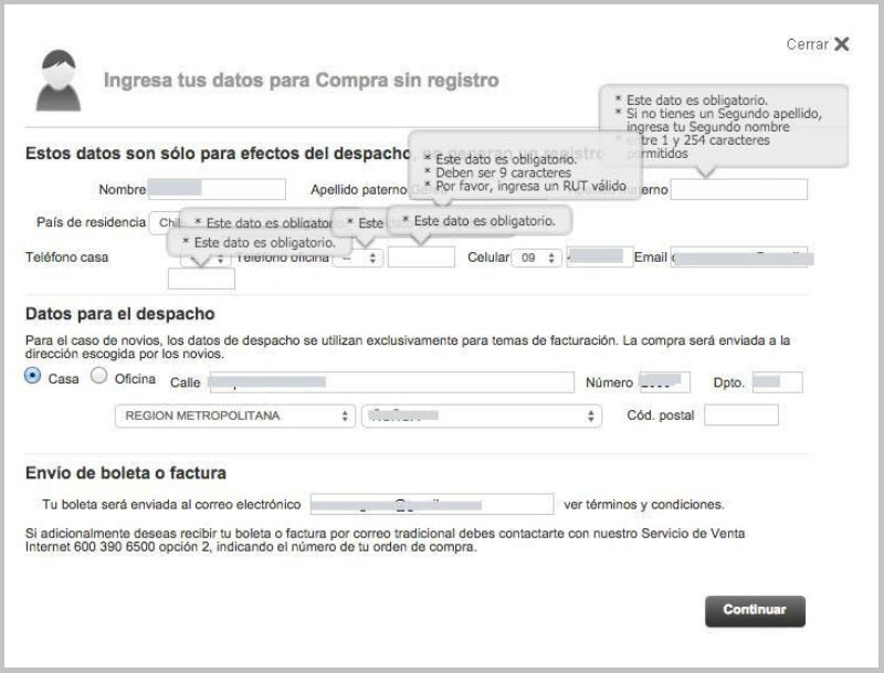
On the other hand, validate that the messages do not make the form an unfriendly experience:
Form source: falabella.com
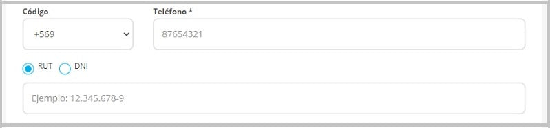
One way to avoid errors in filling out fields is to indicate with examples how the information should be entered.
If it is a phone number, put a fictitious number inside the field or immediately above it that shows the format (+88 998989898). If it is the identification document number, the same (9.999.999-9).
Something very basic in usability and user experience is that buttons should be easy to distinguish from all other content.
That is, they should have a recognizable shape and a contrasting color that attracts attention.
Add to that the detail that their color must be consistent with the action they are proposing. For example, a SUBMIT button should be green or blue, but never red because this color indicates stopping, canceling, or not doing something.
Likewise, the call (the text) must be relevant and coherent for the action it represents. It is advisable to use action verbs: SUBMIT, BUY NOW, SUBSCRIBE TODAY.
Also important is the placement of the buttons. For example, the button should be at the end of the form and centered.
And, although it may seem strange, avoid placing a cancel action button near the CONTINUE or SUBMIT button.
Just make sure the user completes the action without distractions and help them quickly find the SUBMIT button.
The idea is that forms are easy and quick to fill out. Therefore, they must allow pressing the TAB key to move from one field to another.
The goal is to prevent the user from having to use the mouse to go to the next field, moving their right hand away from the keyboard. With this, you will be improving the usability and user experience in your form.
What do you think of these tips? Review your website's forms and check if they comply with these design and user experience precepts.
Reference:
[1] Columbia University Resources and Studies.
To read:
TV Gets Social: Evaluating Social Media Data To Explain Variability Among Nielsen TV Ratings.
To watch:
Luke Wroblewski, one of the greats in the world of user interface design and usability, gives you tips on how to properly optimize your forms: How to Increase Form Conversion | Intel Software.

 By
By