One of the tools we rely on when mapping the user journey is a solid set of customer archetypes. I recently taught a class on how to map the user journey to students in a Human-Computer Interaction course at the School of Engineering of the Pontifical Catholic University of Chile. As part of my PhD in Human-Computer Interaction, I have the opportunity to teach and assist students, primarily in engineering, but also in health informatics, education, and other fields. Teaching is one of the activities I enjoy the most and, without a doubt, it is a challenging and tremendously enriching endeavor.
The user journey course
If you want to discover what a customer journey is, I recommend reading the article Customer Journey: what it is and how to map it, a complete guide to help you start creating your own maps.
Returning to the user journey course, as context, it was a session of just over an hour with more than 40 students I hadn't met before.
It was an introductory class to the user journey, and for most students, it was the first time they had heard of this concept (only a few knew the term as they came from postgraduate or doctoral programs in other disciplines and had professional experience).
After the class, I asked them to map the journey of a student looking to pursue a master's degree in the context of COVID as homework.
Get our analysis in your inbox
Subscribe to the FREED newsletter: applied research, trends and tools.
No spam. Unsubscribe anytime.
How to evaluate a user journey
To objectively grade their work, I created an evaluation rubric based on the content I had delivered in class. These are the aspects I considered:
User and their context
The journey map identifies the user and their point of view.
The archetype is credible, meaning it appears to correspond to real data and situations.
The context of the journey is explained.
Journey map
Identifies the major stages of the journey.
Shows user actions.
Shows touchpoints.
Shows the record of the experience.
Is self-explanatory.
Identifies areas for improvement.
Presentation
Information is presented clearly (e.g., fonts, colors, font size, images).
The visualization of the journey helps tell the story.
The choice of tool used to map the journey is explained.
Each analyzed element was valued with 1 point in the evaluation rubric.
It is worth noting that, although some students submitted a very polished journey in terms of design, the idea was not to evaluate aesthetics. Obviously, presentation is important, which is why I chose to evaluate clarity through font, colors, font size, and the use of images or icons.
I also gave them the freedom to choose the format. If someone wanted to submit a PowerPoint saved as a PDF, they could. While some preferred to use LaTeX, a well-known editor among engineering students that also facilitates writing for publication as a paper, many used a tool as simple as the Word word processor or its Google Docs equivalent, which they then saved as a PDF.
After calibrating the rubric, i.e., applying it as a test in the evaluation to see if the feedback that could be provided made sense, I added some analytical elements that I did not evaluate as such but found interesting to highlight:
Other details not evaluated in the score
Tool used.
Gives a title to the journey.
Describes the user in the journey visualization.
Shows a visualization of the user.
Explains the process behind the mapping.
Most common errors in customer journey mapping
Below are the main findings from the evaluation of the 43 assignments submitted by students who attended the course.
User and their context of use
All students identified the user and their point of view.
All explained the context.
In 58% of cases, the user was credible.
Common error #1: not describing the user precisely
Why is it important?
The user should be a visualization that systematizes real attributes, characteristics, and behavioral patterns. Being an average user does not fulfill the objective.
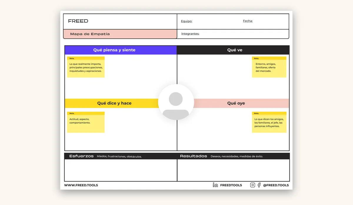
You must describe your user through defined characteristics, not just as an average user, and they must be credible. Identify them by creating a portrait, with questions like who they are, what they do, etc. You can complement this with the User Archetype.
A well-defined user will help you design or redesign a product or service with that specific user in mind.
Examples of what this error looks like:
“User: Carlos, 24 years old, engineering student.”
Could be anyone. Not all 24-year-old engineering students are the same, they don't behave the same way, they don't have the same characteristics, priorities, academic, family, or professional context.
“User: (...) engineering student, graduated or about to graduate.”
Everything was fine until "or about to." As I said before, it's impossible to work with an average user, so we can't put everyone in the same basket. If they have already graduated, they are a clear and precise user. If they are about to graduate, they are a different user.
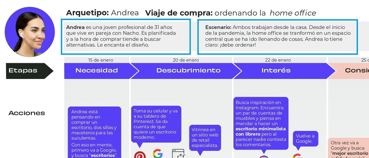
In this example of a purchase journey, we have a well-defined user with their preferences, age, personal situation, and their point of view or context of use of the product or service.
Journey map
84% clearly identified the major stages of the journey.
Only 16% explicitly named the touchpoints.
Common error #2: Confusing or mixing stages, actions, and touchpoints.
Why is it important?
The map should reveal the user's experience with the product or service, and for this, it is essential that it clearly shows the most important stages in their journey, the touchpoints, and their actions.
The main objective is to identify where gaps exist and what their pain points are to leverage opportunities for improvement, but without clarity in these aspects, it will be impossible to know where and how to make changes to optimize that experience.
Stages are often differentiated into pre-service, service, and post-service, but each journey will be unique, so you can be more precise to identify, for example, the moments when they discover a need, their initial searches, the discovery of your brand, etc.
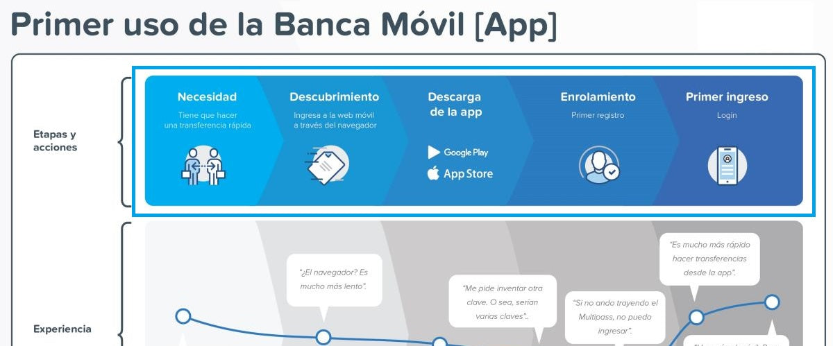
In this example, we see that the stages are very simple and named as Need, Discovery, Download, etc., while the touchpoints are explicitly stated in the text immediately below and with icons.
Common error #3: Not identifying touchpoints.
Why is it important?
It is important to identify touchpoints because that is where opportunities for incremental improvement in the experience arise. This makes opportunities tangible, making them concrete: "improve A, B, C element of website X," "simplify form Y."
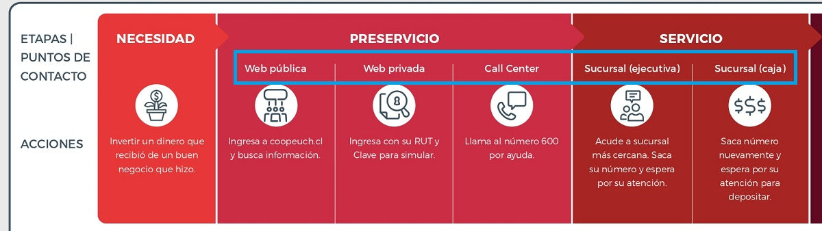
Touchpoints are specific to the experience with your company depending on the channels you have developed: physical branch, website, marketplace, call center, etc.
In this other example, the touchpoints are very clear: Public Web, Private Web, Branch (cashier), etc.
Common error #4: Using acronyms and abbreviations without explaining them.
Why is it important?
The map should be self-explanatory and leave no room for doubt. The language used should be very clear and universal so that everyone can easily understand, especially the details of what the user experienced at each stage and touchpoint.
If you are going to use acronyms and abbreviations because space is insufficient, add a section with an explanation of each. However, it is better to be more concise and summarize as much as possible than to introduce elements that hinder the understanding of your customer journey map by the rest of your team and other colleagues in the company.
Only 26% gave the map a title.
Although not requested, 26% explained the details of the process, i.e., how they came to map the journey. This is a detail that enriches the presentation and, in the "real" world, gives credibility to the work presented to stakeholders.
When illustrating the journey, 42% included a graphical visualization of the user, through an icon or a photograph.
Common error #5: Forgetting to give the mapped journey a name or title.
Why is it important?
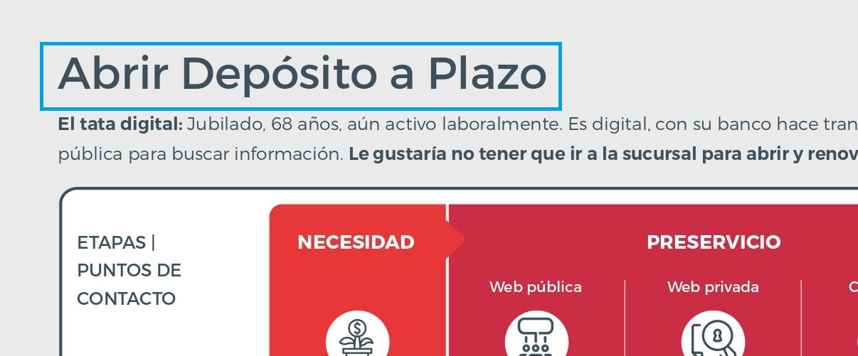
If we want to influence decision-making, we need to bring all stakeholders closer to research results. Therefore, the communication and dissemination of results are as important as the execution of the research. The map's title is important because it attracts attention and clearly states what the infographic or illustration we are presenting is about, even before anyone starts reading each of the stages, actions, or opportunities.
In this example, the title clearly tells us that the customer journey describes the experience of contracting a typical service from a financial company. The name can be that simple and clear.
With this article, I hope to explain the most common errors in customer journey mapping and that the examples make it clear how you can avoid them. What other recurring errors have you seen in customer journey mappings?
To run these exercises collaboratively and remotely, at FREED we use digital whiteboards such as Miro, which let you map, cluster and vote with the whole team in real time. (Affiliate link: signing up through it supports FREED at no extra cost to you.)
Share this article
Follow us on YouTube
Nuevas Economías, Research Thinking and FREED AI Studio: conversations and analysis on business, technology and human behavior (in Spanish).
Take care of your digital marketing strategy. By following our advice, you will avoid making the most common mistakes. Read this FREED blog article now.

 By
By 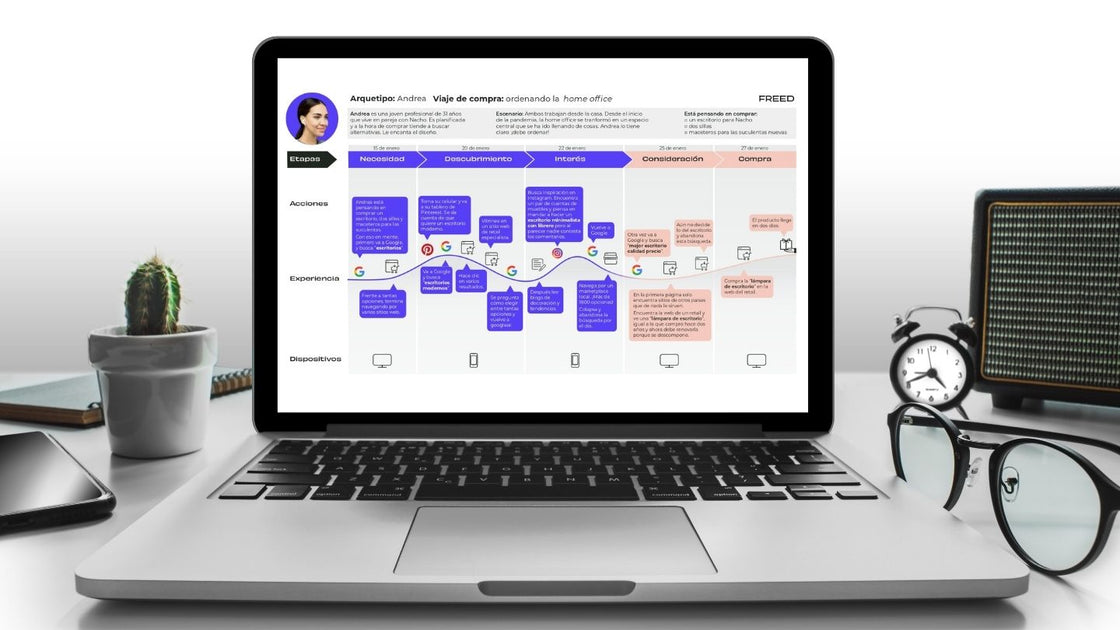

![Digital Marketing Strategy: Mistakes to Avoid [Part 3]](/content-images/859a0087-errores-ideas.jpg)
![Customer Journey: What it is and How to Map it [Complete Guide]](/content-images/6b03118e-portada-user-journey.jpg)