The importance of prototyping in clinical contexts
Before you start reading this article, I recommend you check out the two previous posts in this series dedicated to the clinical context. The first will serve as an introduction to the topic, and the second will cover it from a UX Research perspective: Usability, design, and user experience (UX) in healthcare and UX Research in healthcare. Afterward, come back here so we can continue and explore the prototyping phase and the options available from a user experience (UX) design perspective, part of our broader guide to UX and usability in healthcare.
Once we identify for whom we are designing this new service, what their journey is, and who the other stakeholders are, we need to move on to prototyping and testing this prototype. For this, we must use design methods, tools, and principles, which we will discuss below.
- Before starting to prototype, it is essential to define the objective: why are we doing this, what do we want to achieve.
- Go from basic to complex. Start using low-fidelity prototypes and then, as we progress and validate our assumptions, add complexity to this product.
- It is better to use several inexpensive prototypes than one expensive one, because each testing stage allows us to validate, learn about what has been built, and continue improving.
- After prototyping, a testing phase naturally follows to validate or invalidate hypotheses.
-
Spending too much time, money, and human resources on building a prototype before validating it.
-
Believing that an application fixes everything. We often think of applications that solve different problems when, in reality, what is needed is an analog service. That is, we start the project with a technology, when it is not always necessary, and sometimes the solution requires a mix of analog and digital.
-
Falling in love with the prototype and seeking to validate it at all costs. It is normal for us to want our prototype to be validated, but the idea is not to bias this process because we think it is turning out well, as we really need to validate what the user needs.
- Thinking that a validated prototype is:
- Synonymous with use or sales or traffic (if our solution were a website that people would visit).
- Synonymous with user adoption. We need to separate things a bit, that is, on the one hand, validate the concept and its functionalities, and on the other, in future instances, be able to validate the willingness to use, purchase (in case it is a solution that has a cost), and finally, user adoption.
We can create rapid prototypes without using many technological resources, practically resorting to the tools we have at hand or on our computer. Initial prototypes should be cheap and disposable, and they fulfill the mission of only validating our idea, our most important hypotheses, core functionalities, and value proposition.
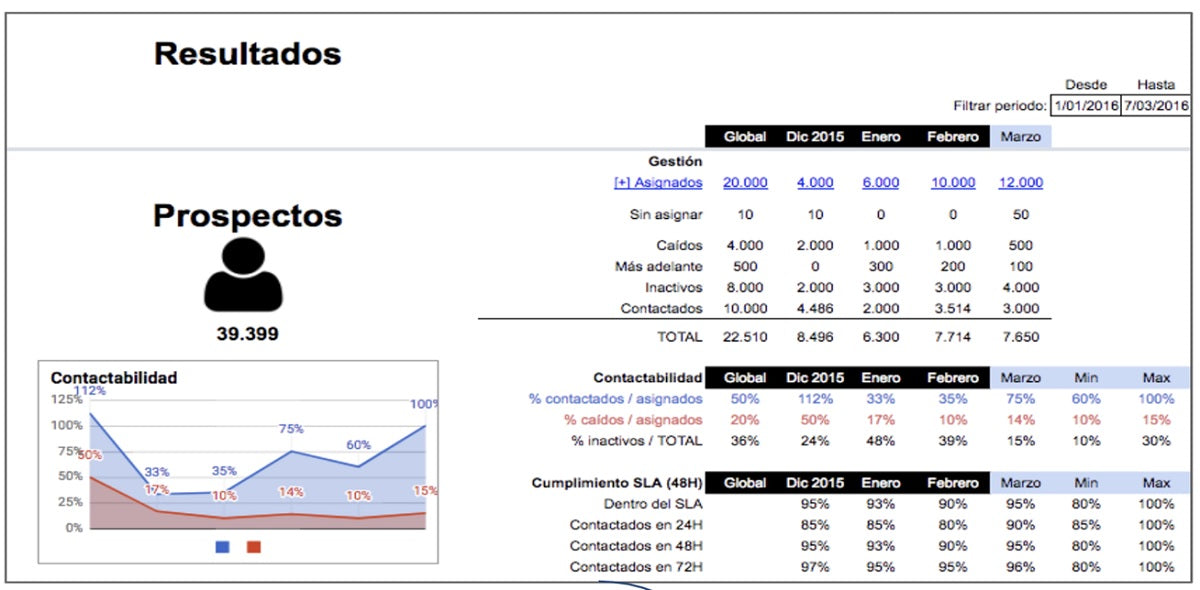
For example, if our solution is a control panel that allows us to have a view of contact management with users or medical appointment booking, we don't need to program anything.
We can create a prototype in an Excel spreadsheet that, initially, will allow us to validate the design, the main functionality, and the interest of our users.
With simple technological resources, you will have obtained valuable results and high research resources with users, needs assessment, and testing.
Next, once we validate this first very low-level prototype, we can move towards a functional prototype where we invest more resources and involve design. Obviously, this more advanced prototype also needs to be tested.
Moving towards more functional prototypes and, finally, also designing what will literally be our solution, one of the important aspects from a user experience design perspective is to try not to reinvent the wheel.
Beyond understanding human factors and design principles, it is also important to know that many resources such as design guides and open-source code are already available. These are components that have been tested, so when designing an interface, we can use them.
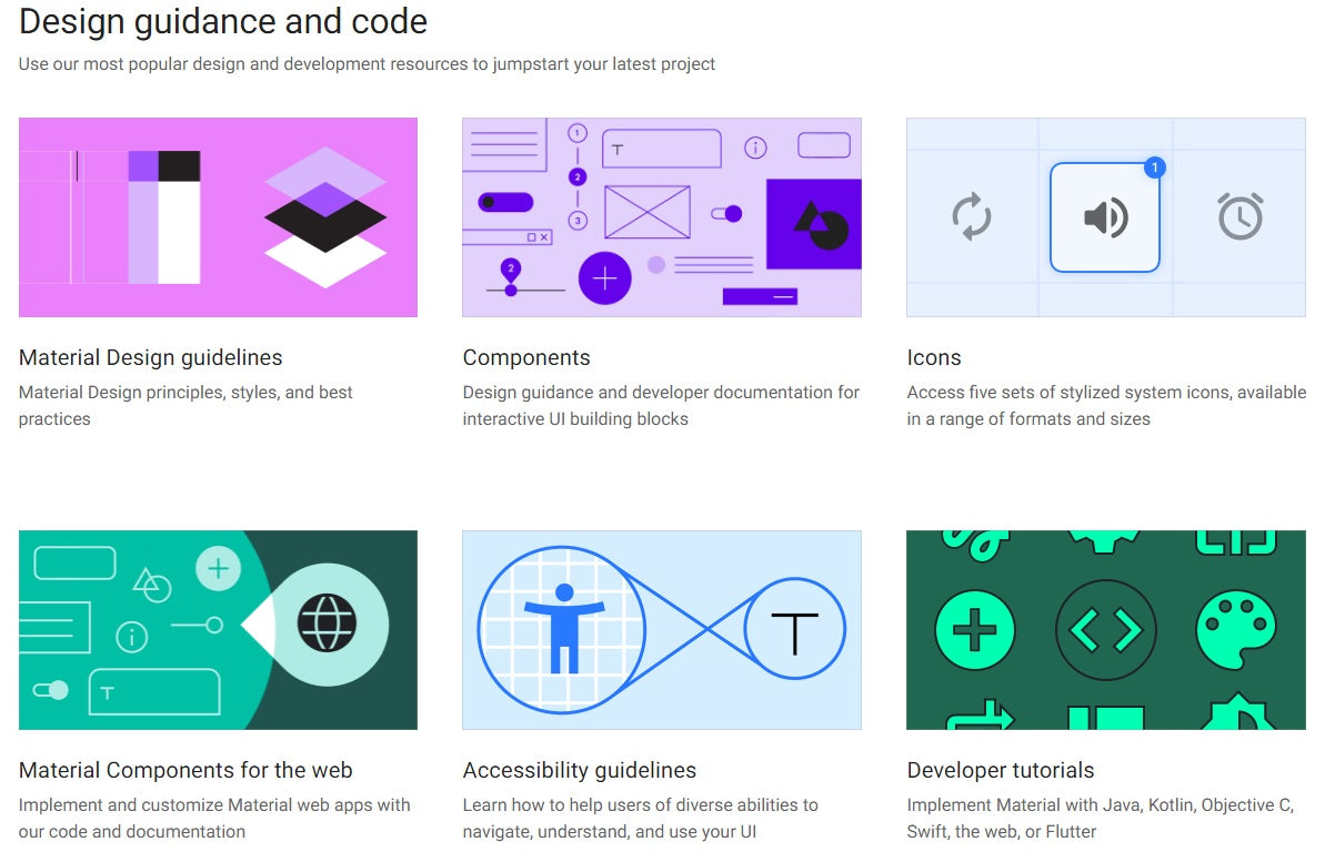
Here's an example from Material IO, an open-source design system for quickly creating products.
You can have a guide with Google components and icons that help create digital experiences. This is a design system that has been used for a long time by design and development teams. As I said before, having these resources at hand, instead of trying to reinvent the wheel, it is preferable to use elements already validated by the industry.
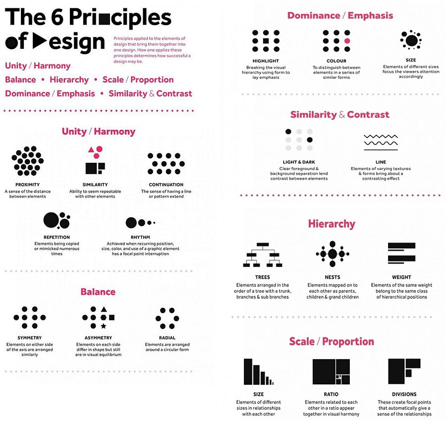
When designing interfaces and solutions, it is essential to understand that there are design principles we should follow. Some of the basics are these six:
- Unity and harmony of elements.
- Balance or seeking symmetry or asymmetry in the set of elements.
- Hierarchy.
- Scale and proportions.
- Dominance or emphasis.
- Similarity and contrast.
Illustration: folo.co.in
For interface design, we also have this great input, which is Nielsen's Heuristics. Although they were created or defined in the 90s, they are still extremely useful because, in the end, they are based on human factors that practically do not change, are not altered, and are transversal. We can use them to design interfaces for computers, applications, self-service modules, large screens, etc.
These ten heuristics are:
-
Visibility of system status. The user must have the system visible throughout their interaction.
-
Match between system and the real world. We cannot speak in a code that only we as creators understand.
-
User control and freedom to allow the user to decide if they want to exit an interaction and actually do so.
-
Consistency and standards. There are standards that are typical of web navigation, for example, we know that usually the login in a system is at the top right or that contact details are at the bottom in the footer. Therefore, the idea is not to reinvent the wheel and not change that because people are already accustomed to certain ways of navigating.
-
Error prevention. Errors can arise in all interactions, but we are interested in preventing them. Also, minimizing the user's memory load, knowing that the memory we have available to perform a task is limited. So, we don't want the person to have to retain everything we communicate on the first screen. For example, when there is a complex flow divided into four steps, we don't want the person to have to remember things that happened in the first step when they reach step number four, but rather that the interaction flows smoothly.
-
Flexibility and efficiency of use.
-
Aesthetic and minimalist design. The idea is that interactions should be as simple as possible and not require reflection or a high level of digitalization so that, eventually, anyone can perform them.
-
Help users recognize, diagnose, and recover from errors. Evidently, errors can occur, but if they do, we want the person to be able to continue performing the task and not get stuck.
-
Help and documentation. It is important that the user, while navigating a system, has access to, for example, frequently asked questions, a help chat, a contact phone number, etc.
It is also important to understand if there are design patterns that characterize systems already in use. Why is standardization important? Because we can prevent future problems. If today people are accustomed to a certain way of doing things and we radically change this way of doing things, we can create problems.
For example, the FDA (U.S. Food and Drug Administration) establishes the standards that characterize the infusion pump*, and the purpose of this standard is to:
- Establish additional requirements for infusion pump manufacturers.
- Facilitate proactive device improvements.
- Increase user awareness, meaning that the person performing a task takes into account each stage and does not do things mechanically. While we want them to feel comfortable because we are all aligned and use a common language, we also want the person to be aware of the steps they are taking, especially in complex tasks or those that can have a significant negative impact and where we cannot make mistakes.
And that concludes the third article in this series dedicated to usability and UX in healthcare. This will continue with two more articles, so stay tuned to our UX Experience blog.
Tell us if you have experience prototyping services for the healthcare sector. What did you think?
(*) Center for Devices and Radiological Health. U.S. Food and Drug Administration. Infusion Pump Improvement Initiative.
Main image by Hush Naidoo on Unsplash

 By
By