A stakeholder map is a visual method that identifies all the people, teams, and organizations involved—directly or indirectly—in a service, and the relationships between them. It helps a design team to not only focus on the end-user but also to understand the complete system before proposing changes.
It is a graphical representation, typically with sticky notes and arrows on a flip chart, that places all those involved in a service in one space: the end-user, other secondary users, the organization providing the service, its internal departments, suppliers, regulators, and any other stakeholder that influences the outcome. It is not an organizational chart: what matters is not the formal hierarchy, but the real influence each stakeholder has on the experience being designed.
It helps avoid the most common mistake in innovation projects: designing with only the end-user in mind and then discovering that another stakeholder—an internal department, a supplier, a regulator—has veto power or influence over the solution. It also helps detect stakeholders invisible at the beginning of the project, such as the support team that receives complaints or the external provider that executes part of the service, who are key for any redesign to work in practice.
In digital service projects, it is also advisable to include technical support teams and content administrators, because although they do not have direct contact with the end customer, their internal decisions directly affect the quality of the experience that customer perceives.
- End-user or customer, who directly receives the service
- Secondary users, such as a family member or an assistant who intervenes in the decision or use
- Internal teams of the organization: customer service, operations, technology, legal
- External suppliers and partners who execute part of the service
- Regulators or public entities, when the service operates in a regulated sector
- Competitors or substitutes, when it is useful to understand the broader context
In our workshops, we dedicate between 30 and 45 minutes to this exercise, with teams of 3 to 6 people, as soon as the research phase closes. The usual order is:
- Write each identified stakeholder on sticky notes, one per sticky note, without grouping yet
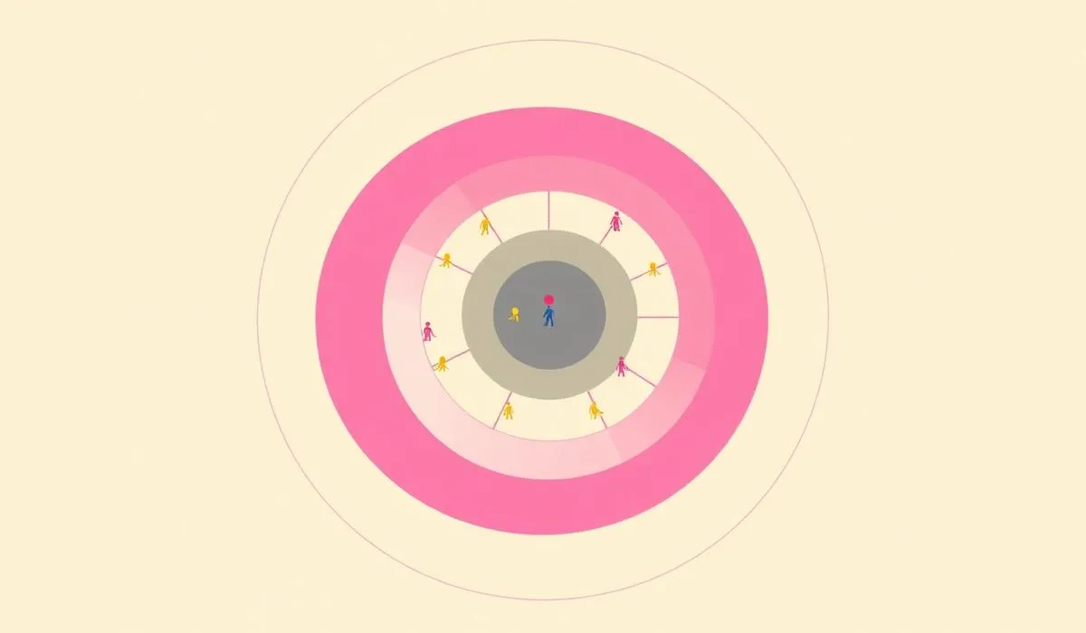
- Place the main user or customer in the center of the flip chart
- Distribute the rest of the stakeholders around, according to their proximity or distance from the service
- Draw lines or arrows between stakeholders who have a direct relationship, indicating the type of link (informs, pays, demands, provides service to)
- Mark with a different color the stakeholders with greater decision-making or veto power over the project
When the team detects a relevant tension relationship, it is advisable to write a short phrase next to the line summarizing the conflict, for example "demands speed but does not share information," because that phrase often later becomes a concrete design challenge to work on in a co-design session.
It is not enough to list stakeholders: what adds real value to the map are the relationships. It is advisable to differentiate at least three types of links: information relationships (who tells what to whom), dependency relationships (who needs whom for the service to work), and tension or conflict relationships (where the interests of two stakeholders clash). Using lines of different thickness or color for each type helps the map to be read at a glance, without the need for additional explanation.
In projects with complex services—for example, health or financial—the stakeholder map can easily grow to more than twenty sticky notes, making it difficult to draw conclusions. When this happens, in our workshops we ask the team to classify each stakeholder on two simple axes: level of influence over the project and level of interest in the project moving forward. Stakeholders with high influence and high interest are priorities to involve early, while those with low influence and low interest can be monitored without dedicating the same coordination effort.
- Confusing the stakeholder map with an organizational chart, prioritizing formal hierarchy over real influence
- Leaving out uncomfortable stakeholders, such as an internal department that often blocks projects
- Building the map without field data, based only on the design team's assumptions
- Not updating it during the project, when new stakeholders appear in practice as progress is made
Once built, the stakeholder map becomes direct input for other methods. It helps decide whom to interview or observe in the research phase, to define which roles to invite to a co-design session, and to identify in which segments of the customer journey stakeholders other than the user intervene, which often explains bottlenecks that are not detected by looking only at the customer experience in isolation. It is also a good starting point before setting up a desktop walkthrough, because it allows deciding in advance which stakeholders to personify in the scene.
If you want to follow these facilitation exercises, subscribe to the FREED YouTube channel.

 By
By